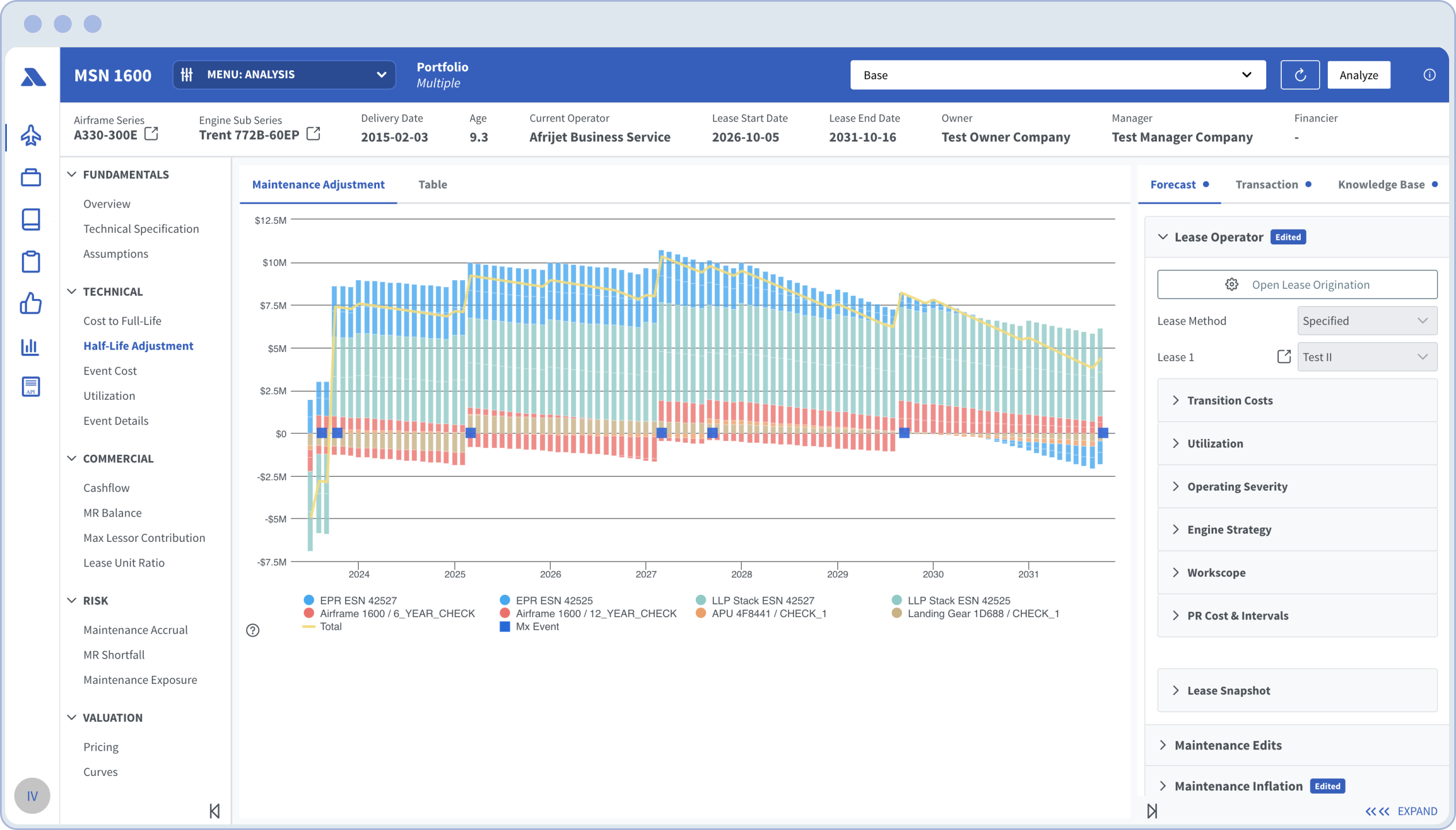
As the sole designer in the team, I collaborated closely with the CEO, senior executives, engineers and key stakeholders to discover, ideate and trace the path for the Aerlytix Analytics Suite.
Background
Aerlytix started as a technology team hired by the Stellwagen Group, a renowned aviation lessor a few years back. I was one of the first employees and the sole designer, working alongside three engineers, a finance expert with aviation expertise as product owner role that learned and worked along with the experts and the CEO, who was also a seasoned engineer.
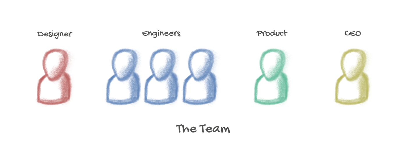
In the initial stages, we were unsure how to find the focus on the problems and what to tackle first, as there were a number of end points within the aviation leasing world we could have started with.
Challenges
As our investigations within the lessor progressed, clear challenges surfaced:
- Industry Tech Savviness: The industry was not technology-savvy; mainly reliant in Microsoft Excel and some plaforms providing data i.e. appraisers, one industry based CRM system.
- Uncharted territory: We were the first to try and introduce tech solutions to the industry, with no existing competitors' strategies to reference. In other words, we were navigating an area of the industry never explored before.
- Undocumented Processes: The industry's processes were poorly documented, with much of the knowledge deeply embedded in the experts' experience.
- Limited Expert Time: Our team had limited access to the senior experts, who had busy schedules, making it challenging to learn from them.
In the beginning, additional to these challenges came that inherent to the formation of our team; getting to know and trust each other was an unexpected challenge which required us to adapt to the dynamics of the industry.
Problems Identified
Spending time with a number of team experts it became evident the #1 tool they rely on to manage this multimillion dollar business was Microsoft Excel. While it is a blessing how amazing and accessible Excel is, it is incredibly complex and cumbersome to maintain big (huge actually!) Excel files with multiple tabs and models interconnected with portfolio investments and assets details.
There was a lack of integration with the various data sources that the team relied on. This deficiency meant that a substantial amount of manual labor was required to compile and organize essential information for contracts, deals, and maintenance details related to aircraft.
As a result, a few key pain points became quite evident at the company level (which were an industry level) providing a list areas to look into:
- Data fragmentation: Information was scattered across multiple systems, people and formats, making it difficult to obtain a unified view of the data.
- Innefficient maintenance forecasting: Predicting maintenance schedules and costs was challenging due to the lack of automated tools and reliable data. This led to potential downtime and increased operational costs.
- Complex lease cashflow modeling: Creating accurate cash flow models for leases was a complex task that required integrating various data points. The manual processes in place were prone to errors and time-consuming, affecting financial planning and analysis.
- Difficulties in pricing and valuation: Establishing the right pricing and valuation for aircraft leases was difficult due to inconsistent data and the absence of advanced analytical tools.
- Inefficient portfolio management: Managing a diverse portfolio of aircraft leases was cumbersome without a centralized system. This led to missed opportunities and potential risks in asset management.
- Lack of integration with other tools: Systems did not seamlessly integrate with other essential tools and software used by the industry resulting in redundant efforts and slowed down workflows.
- Challenges in real-time fleet tracking: Monitoring the status and location of the fleet in real-time was difficult, leading to delays in responding to issues and inefficiencies in fleet operations.
Personas
There were four key stakeholders levels which represented the core pillars of the business with their own specific needs but influential to each other to have access to specific areas of information to perform their tasks efficiently.
I interviewed these stakeholders to dig deeper on their obligation and daily tasks within the business and decided to build personas to provide the necessary perpective to the team about the target the audiences we needed to address:
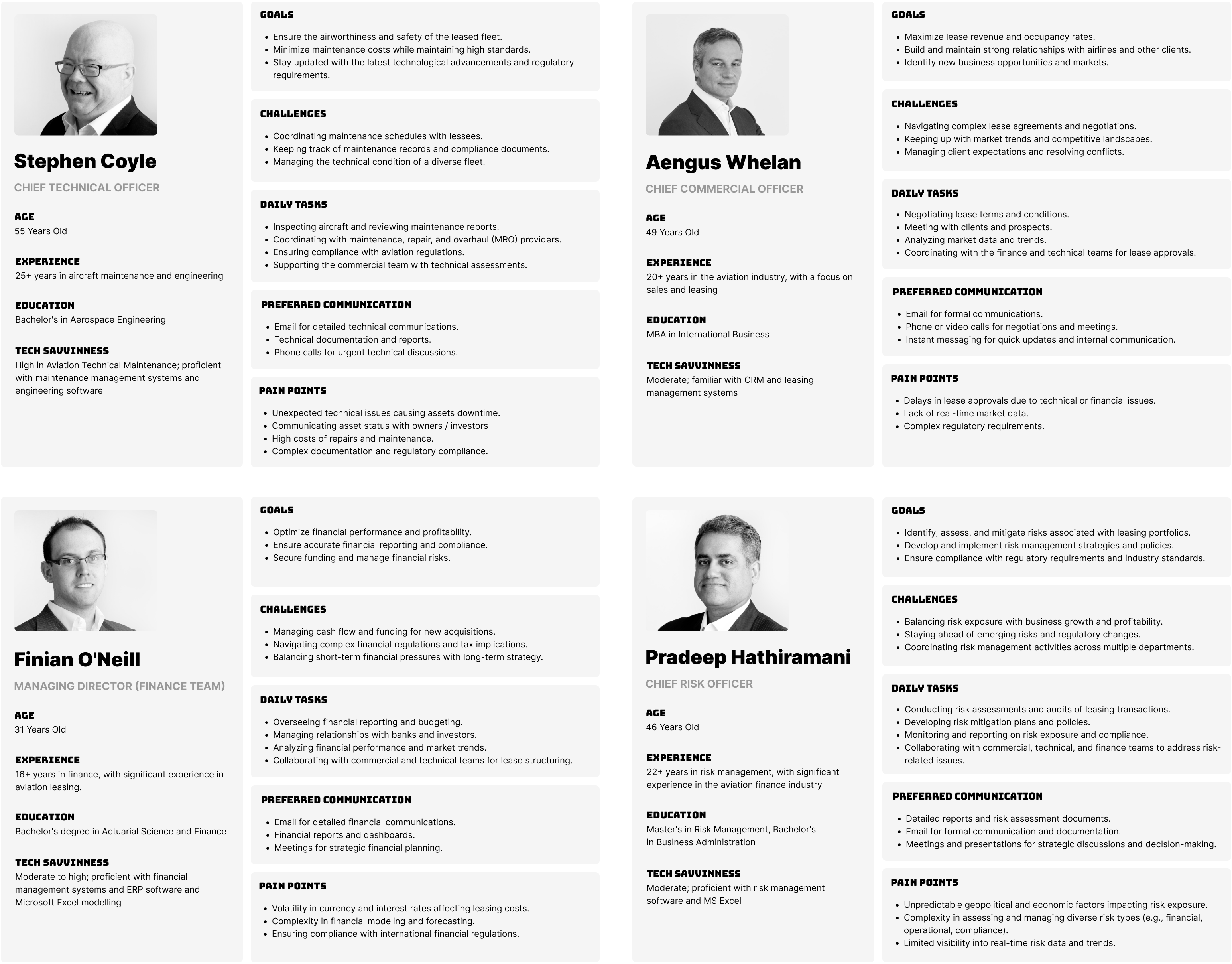
These were, at the time we started, four leaders in the team tackling very specific problems in the industry
The Pillars of the business
Once identified and studied these four key stakeholders in the leasing businesses, we needed to delineate each of these specific areas of interest within their respective jobs. I organised a few whiteboard sessions with the team to discuss what areas of focus we could find important to each of these pilars. And so we started brainstorming a few flows for aircraft specifically and aircraft in the context of portfolios:
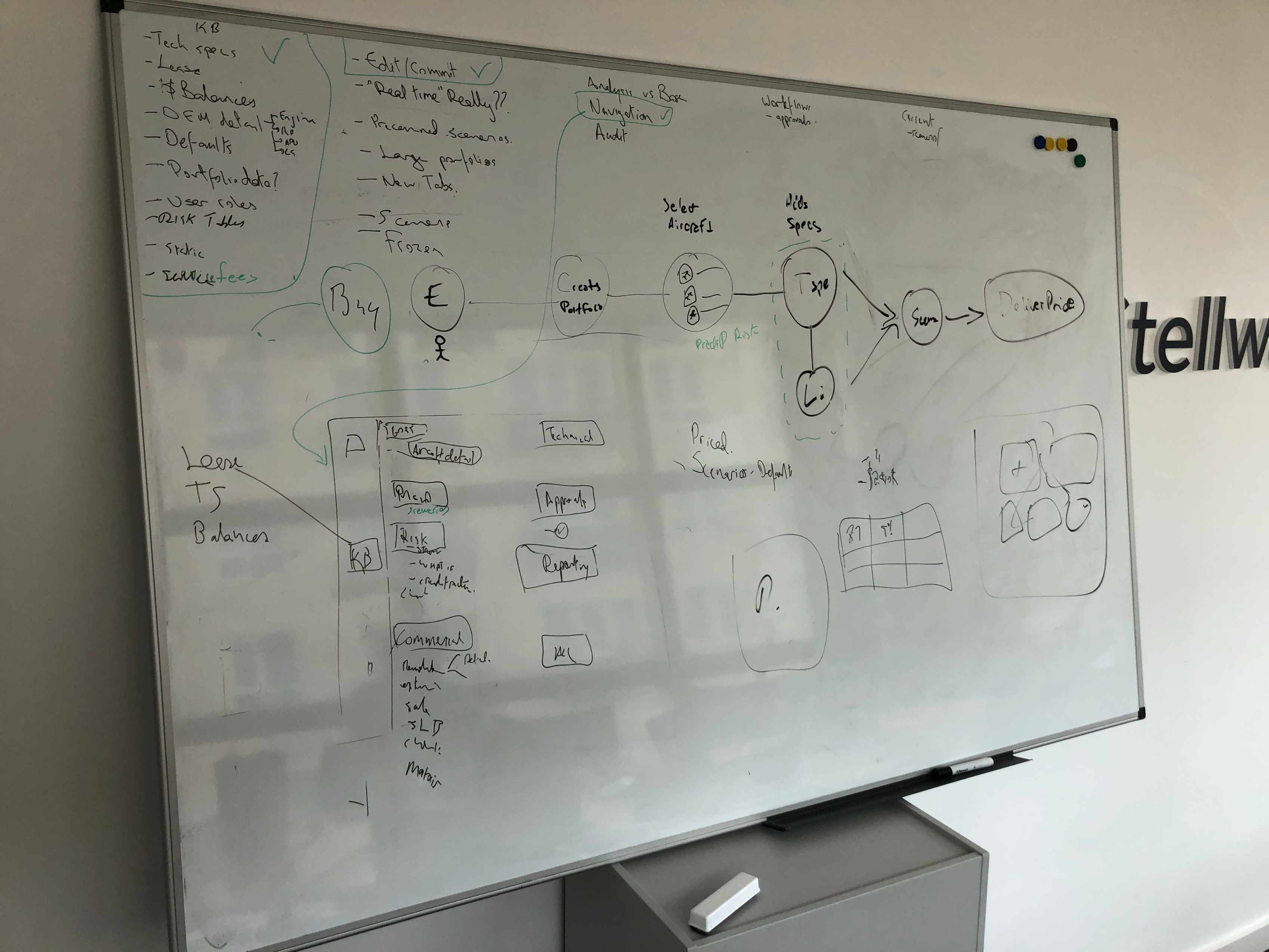
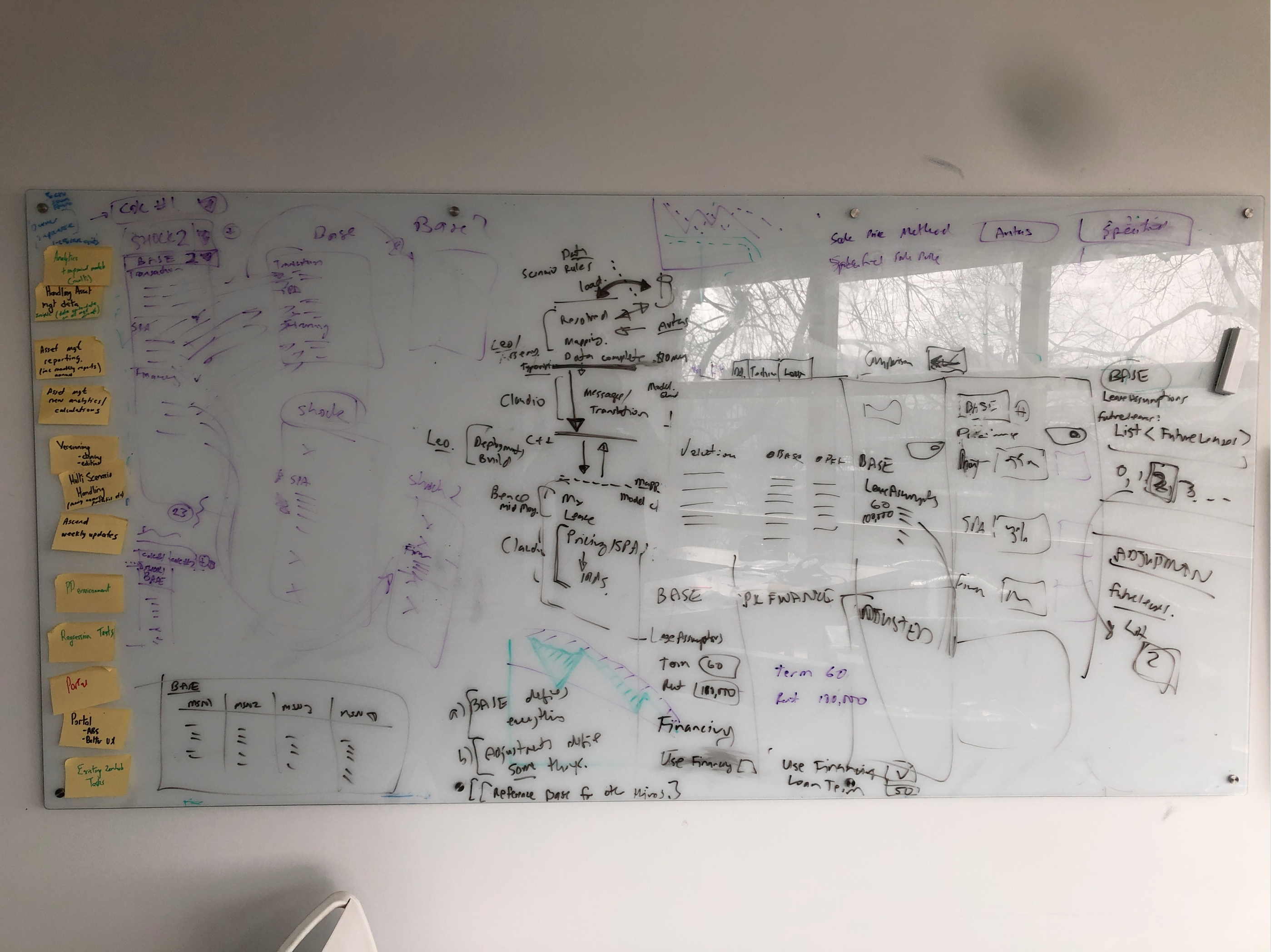
There were quite a few sessions to narrow down specifics.
These shots represent a couple of them where we cover the potential UX and technical contrains engineers presented
After the whiteboard session I organise what we discussed and put a quick diagram in Miro for a potential core structure of the MSN (Aircraft) we needed to target. Also just in case there was anything else we could add that we might have missed from the workshop. This gave the team a representation of the areas to cover in order to have a product the industry could rely on.
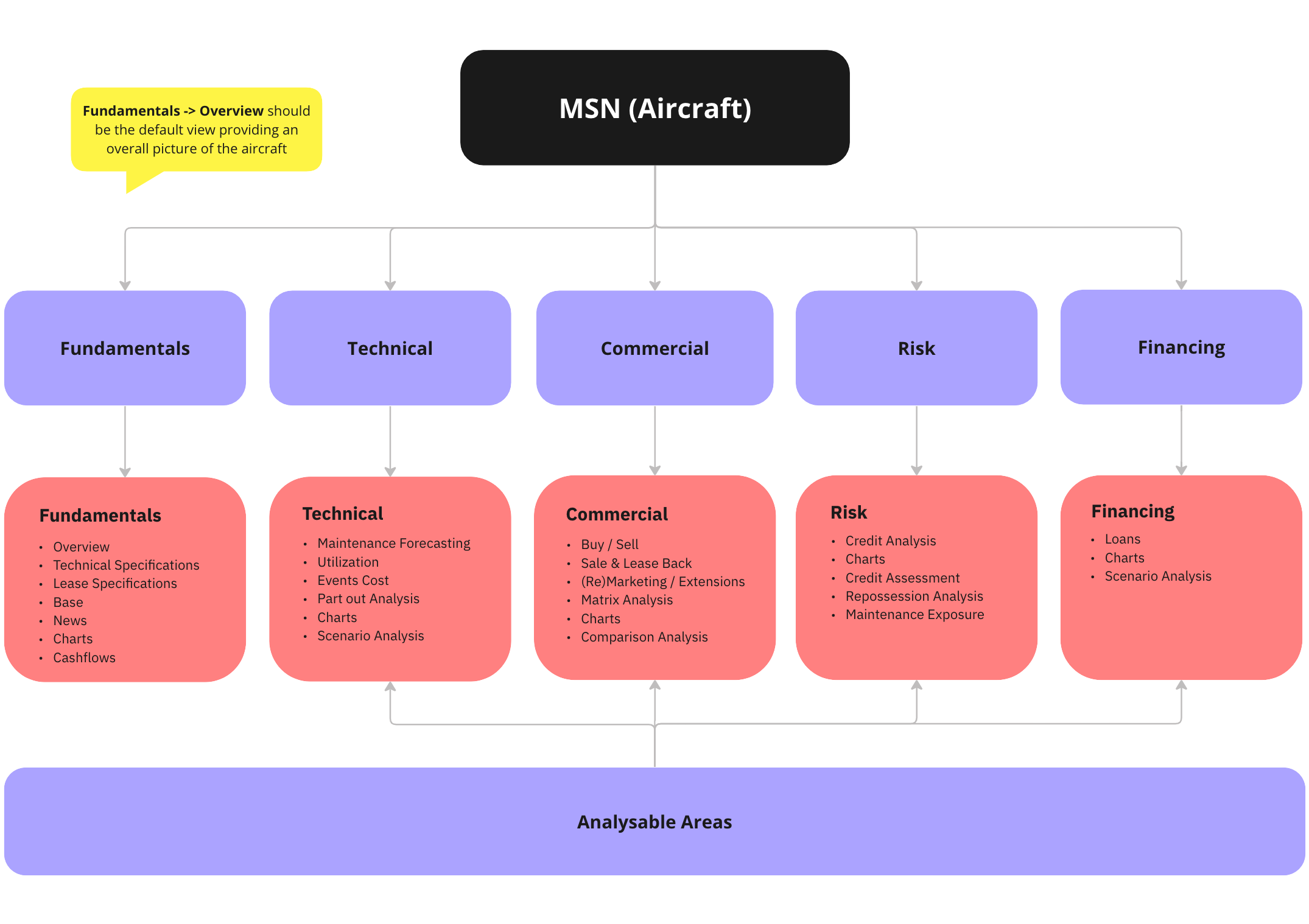
Now that we conceptualised and visualise the structure of how to analyse an aircraft, I started sketching a few ideas around the structure of the app. Meanwhile the engineers started building up the infrastructure.
Ideation sketches
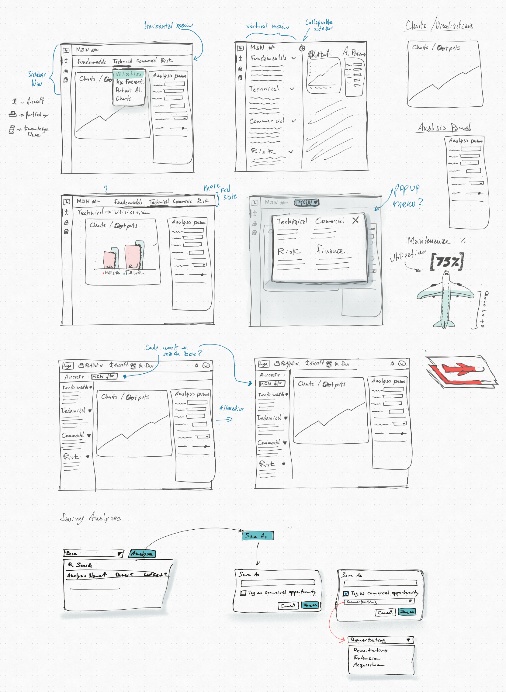
Once we determined a high-level architecture of the areas we needed to cover, I began exploring ideas on the structure of the app. There were several key considerations I kept in mind, given the degree of uncertainty around how and what we were about to build:
- Navigation of the App: I focused on designing a navigation system that could efficiently handle the extensive amount of information we needed to render. This involved creating a layout that was intuitive and user-friendly, ensuring users could easily find and access different sections of the app. Given the complexity and depth of the data, it was essential to develop a navigation flow that minimized user effort and maximized usability.
- Real Estate and Views: Each page's layout was carefully considered to optimize the display of necessary information. Our client base was accustomed to working with large data sets in Microsoft Excel, so it was crucial to ensure that our app provided a similar level of detail and accessibility. I experimented with different ways to present data clearly and effectively, ensuring that users could quickly grasp and manipulate the information without feeling overwhelmed.
- Scalability: Given the iterative nature of the project, scalability was a primary concern. I designed the app structure to be adaptable and capable of handling significant growth. This meant creating flexible layouts that could accommodate new features and data as they were added. Scalability considerations included ensuring that the app could integrate additional modules seamlessly and that the user interface remained consistent and coherent as new content areas were developed.
During this ideation phase, I produced a series of sketches and low-fidelity mockups to visualize these concepts. These sketches served as a foundation for discussions with the team, allowing us to brainstorm and refine ideas collaboratively. By iterating on these initial designs, we were able to identify potential issues early and adapt our approach to better meet the needs of our users and the goals of the project.
Wireframing
In the wireframing stage, I began by exploring several views and user flows for the analytics suite. My goal was to create a cohesive and intuitive user experience that would address the identified pain points and meet the needs of clients users base. To ensure the wireframes were robust and aligned with user expectations, I conducted multiple iteration rounds. During each round, I presented the wireframes to the full team, including stakeholders and technical experts, to gather comprehensive feedback. This collaborative approach allowed me to refine the designs based on real-world insights and technical feasibility.
Using Figma, I started to create low-fidelity designs that focused on the layout, navigation, and key functionalities of the analytics suite previously discussed. These initial wireframes were crucial in visualizing the overall structure and flow of the application without getting bogged down by details.
During the design critiques, we discussed aspects such as user interaction patterns, information hierarchy, and data visualization ideas. Feedback from these sessions highlighted areas for improvement and provided new ideas that I incorporated into subsequent iterations. This iterative process helped in keeping expectations realistic and ensuring that the designs were both user-friendly and technically feasible.
Additionally, I collaborated closely with the engineering team to understand the technical constraints and opportunities, which informed the wireframing process. This collaboration ensured that the designs were not only innovative but also implementable within the project's scope and timeline.
By the end of the wireframing stage, we had a well-defined blueprint for the analytics suite that served as a strong foundation for the next phases of the design and development process.
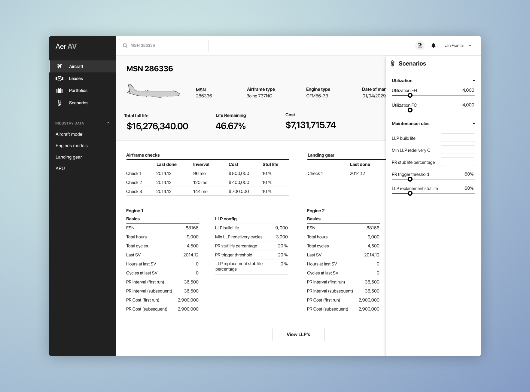
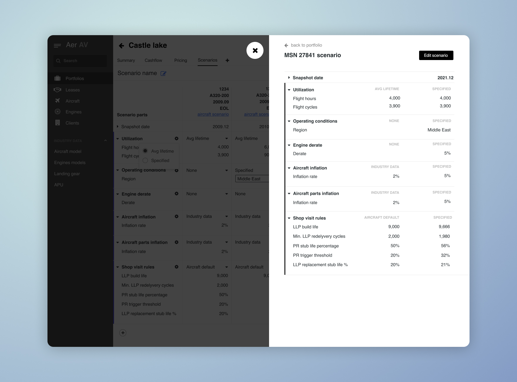
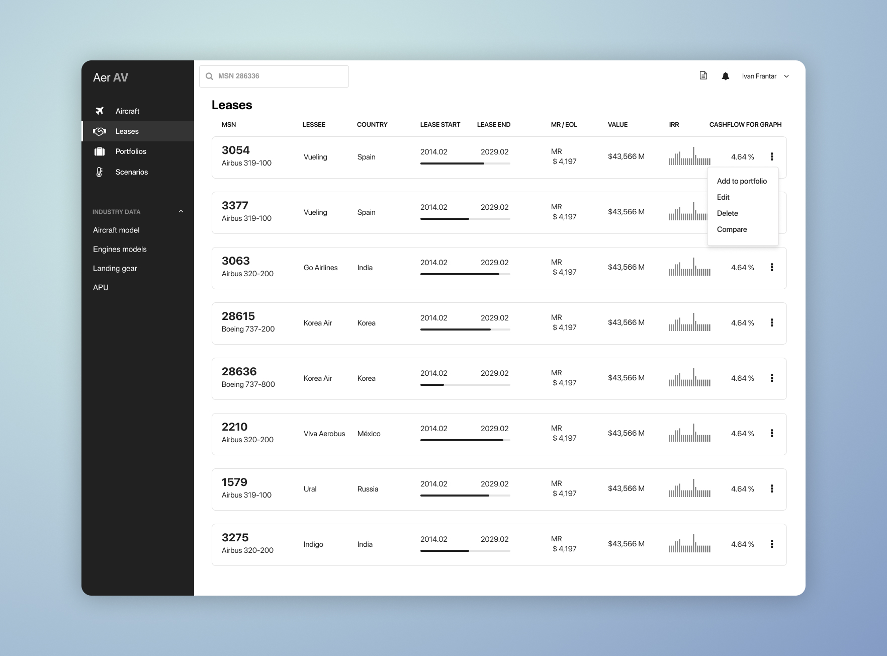
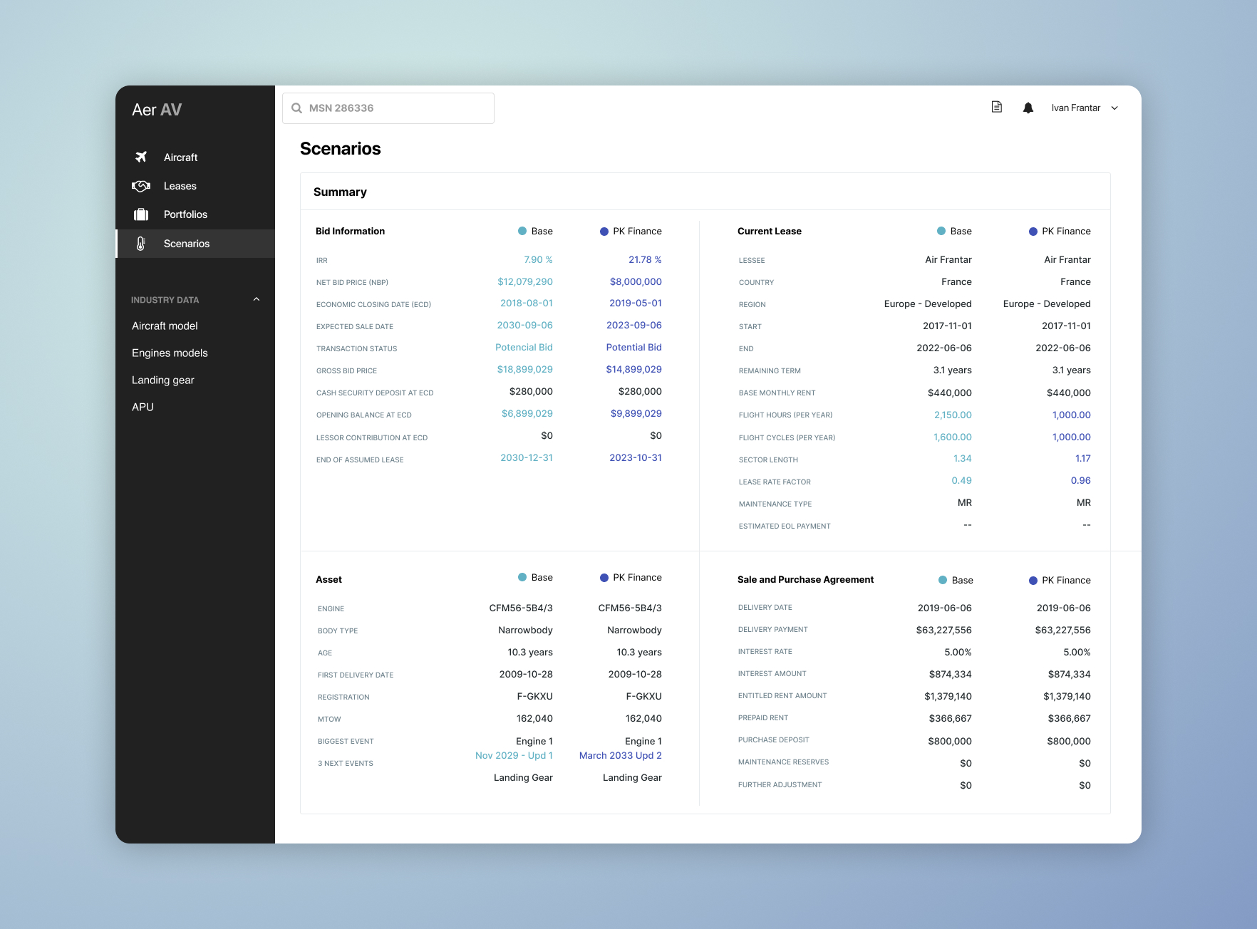
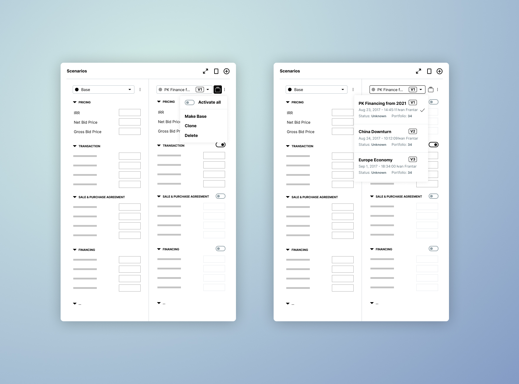
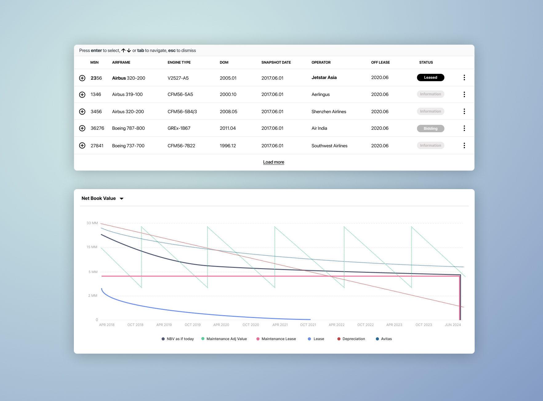
A sub set of screens I started playing with which included the main view we wanted to start with and some components.
The Branding
As the app's flows and functionality began to take shape and the engineers started working on the frontend, backend, and quantitative aspects, it was time to start thinking about branding. While I remained actively involved in ensuring the UX outputs were implemented correctly and supporting the engineers as much as possible, I also began to focus on how we wanted to present Aerlytix to the world.
Version 1
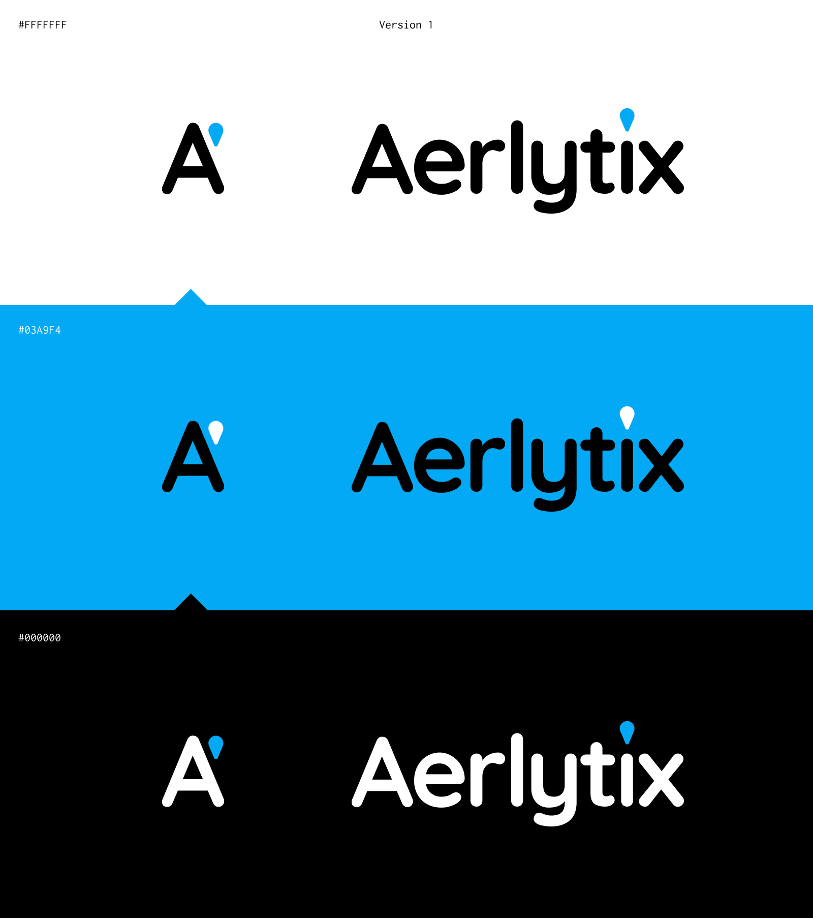
The first version of the Aerlytix branding featured a clean and modern design, emphasizing simplicity and clarity. The logo incorporated a sleek, sans-serif typeface with a unique accent on the letter 'A'. This accent, a small blue teardrop shape, was designed to symbolize precision and attention to detail, key attributes of our analytics suite. The color palette included a bright blue, which conveyed trust and innovation, complemented by black and white for versatility and contrast. This version aimed to establish Aerlytix as a forward-thinking, reliable partner in the aviation leasing industry
Version 2
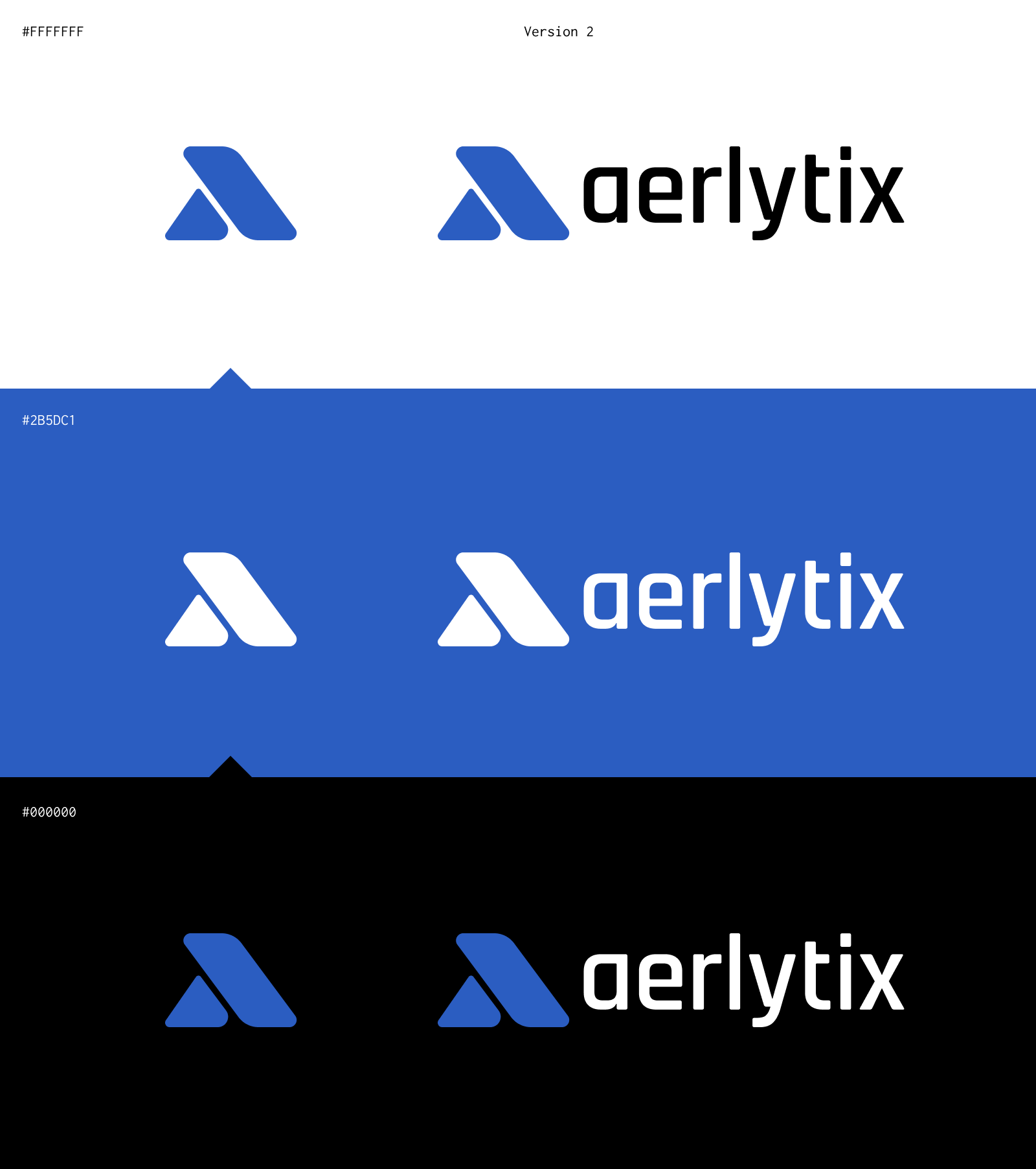
The second version of our branding marked a significant evolution and maturity for the company. It retained the modern aesthetic but introduced a more dynamic logo. The new design featured a stylized 'λ' lambda symbol that could stand alone as a recognizable icon. The symbol aligned well with math, computers and quantitative models which are highly ingrained in the nature of aviation finance. The typography was updated to a more rounded, contemporary font, which paired well with the symbol. The color scheme shifted to a deeper blue, adding a sense of depth and stability. This version was designed to reflect Aerlytix's growth and maturity, positioning us as a sophisticated and dependable leader in the market.
Implementation
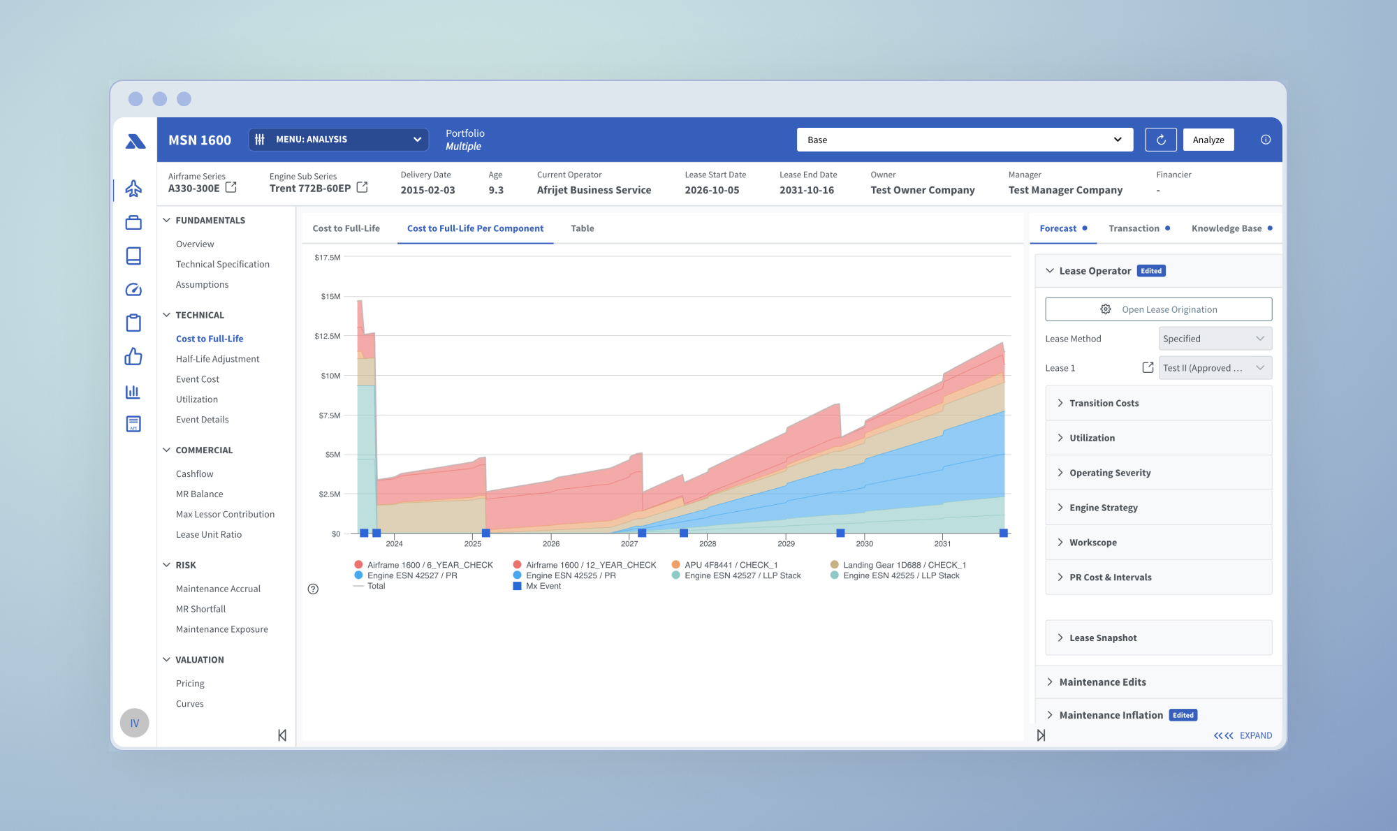
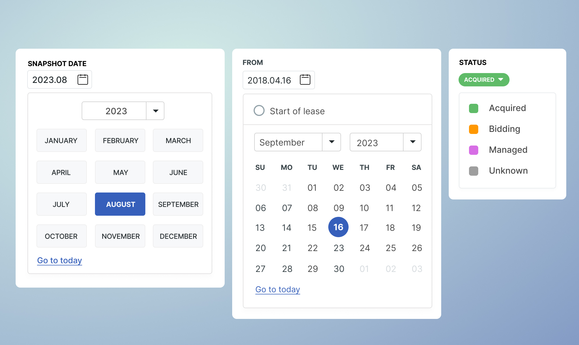
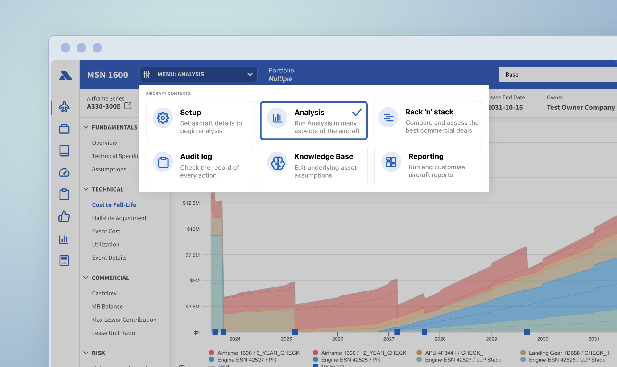
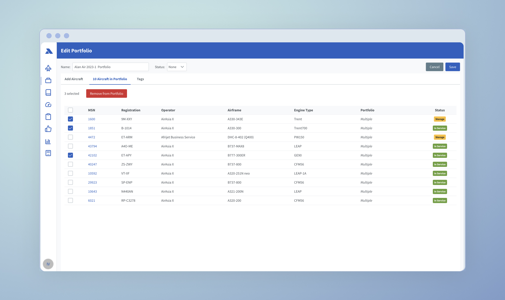
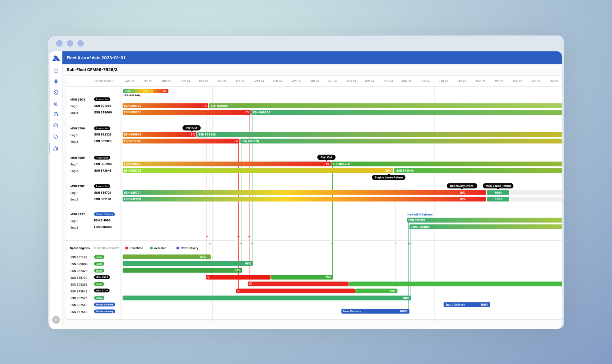
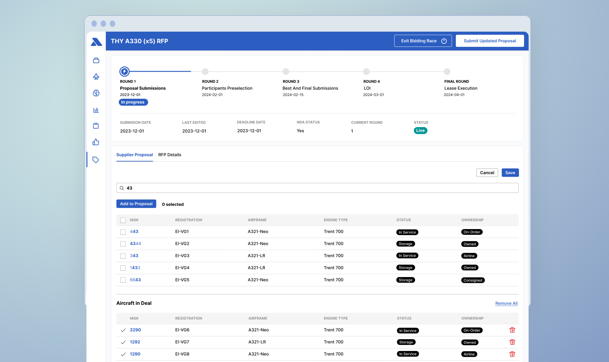
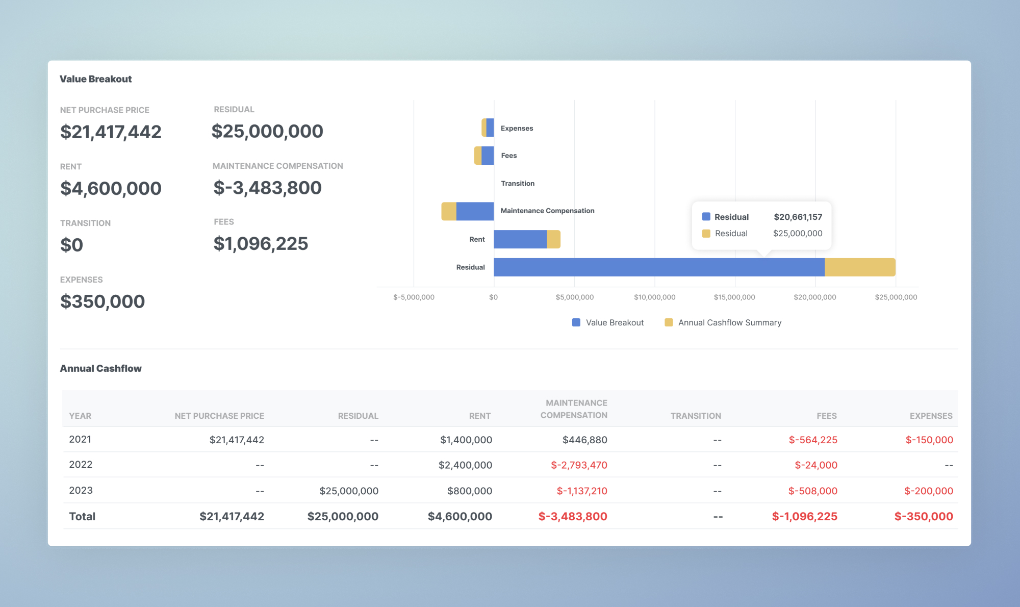
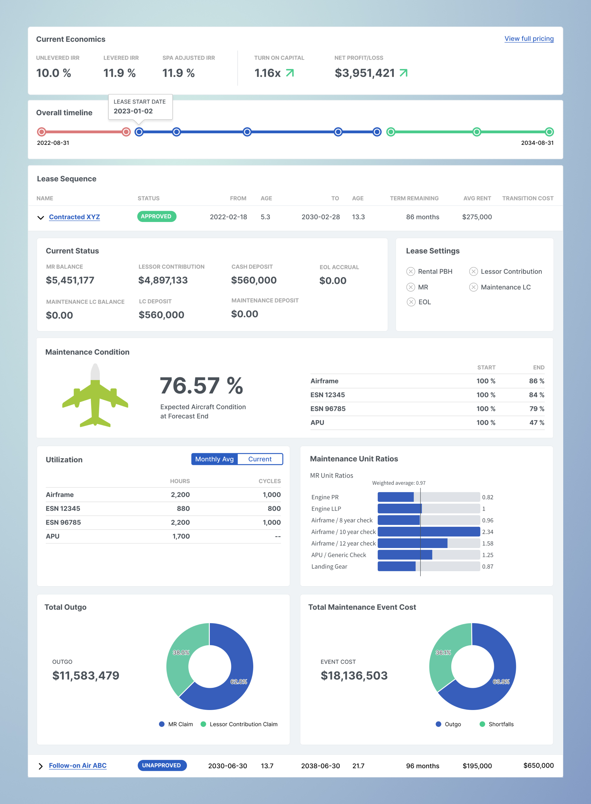
The implementation of the Aerlytix Analytics Suite involved numerous stages, each critical to the development of the final product. The journey from initial concept to final deployment was marked by iterative design and development, ensuring that each feature met the specific needs of our users. In this section, I provide a comprehensive compendium of key views and component snapshots. These visuals aim to give a detailed overview of the platform's modules, highlighting the thoughtful design and robust functionality embedded in each aspect of the suite.
These screens include various facets of the platform, from the intricate pricing page, which allows for precise financial modeling, to the sophisticated portfolio building feature that supports dynamic asset management. Additionally, you will find detailed visualizations that bring complex data to life, making it accessible and actionable for users. An overview page consolidates the most relevant information into a single, intuitive view, ensuring that critical insights are always at the user's fingertips. Together, these elements illustrate the comprehensive capabilities and user-friendly design of the Aerlytix Analytics Suite, showcasing our commitment to delivering a top-tier analytics solution.
Conclusion
The journey since the early days has been hectic yet rewarding. As a designer, transitioning from predominantly B2C products to a heavily B2B-focused finance platform was particularly challenging. The steep learning curve in finance, combined with the technical knowledge required in aviation, demanded a significant amount of industry-specific learning.
This case study encapsulates my journey from the formation of our team to the initial iterations and conceptualizations that eventually led to the development of the Aerlytix Analytics Suite. As the product evolved, numerous features were added and iterations, and detailing each would result in an extensive case study. Maybe I'll get to them in more specifically in the future.
Since its inception, the company has significantly expanded its client base, establishing itself as the de facto platform for analytics and integrations in aviation finance. Here are a few key statistics:
