Project Overview
When I joined CurrencyFair, I started as the sole designer, responsible for fixing and improving the user experience of the company’s web app. At the time, CurrencyFair did not have a mobile app, and the existing web app only worked on desktop, without responsive functionality. My initial focus was to make the web app work across all screen sizes, improving accessibility for users on mobile devices. To do this and because the speed on delivery, I used Twitter Bootstrap (at the time Twitter created the framework) and replicated all the user experience to this new framework + additional updates to the experience.
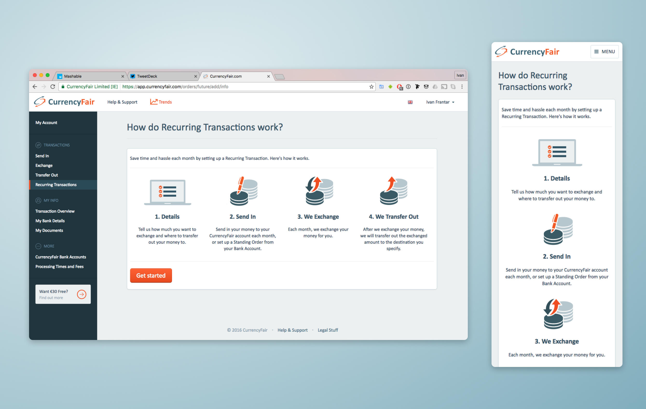
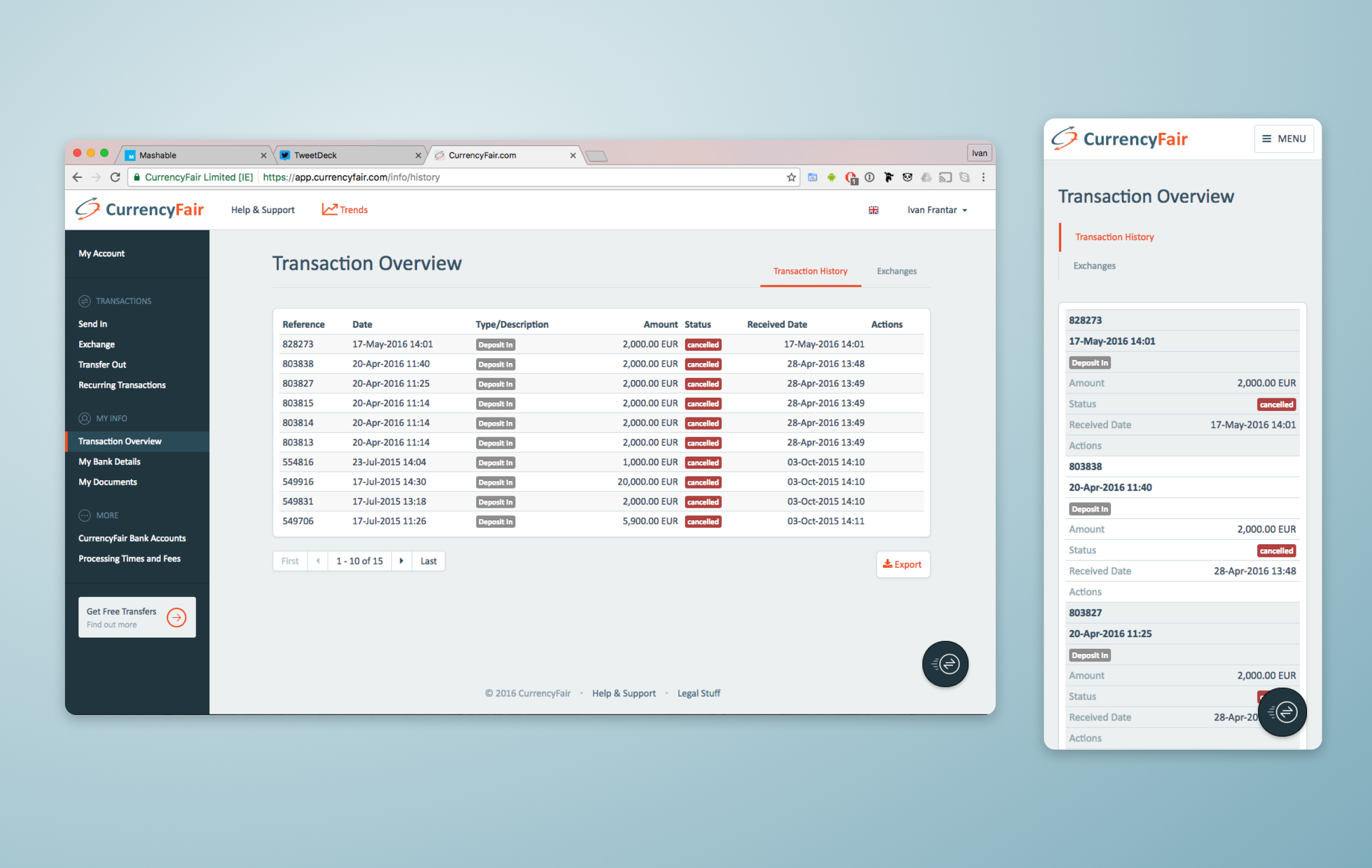
A couple of examples of the redesign I did at the time of the web platform and responsive mobile view
The Shift to Mobile
After a few years of working on the core product, and following several rounds of investment, CurrencyFair was finally ready to build its mobile app. As the lead designer on this project, I was responsible for creating the app's user experience from the ground up, focusing initially on iOS.
With limited resources, we outsourced the development to an agency. I took on the role of managing the interaction with the agency, ensuring timelines were met and coordinating closely with our Head of Product. This involved frequent updates, feedback loops, and revisions to ensure the app met our users' needs and expectations.
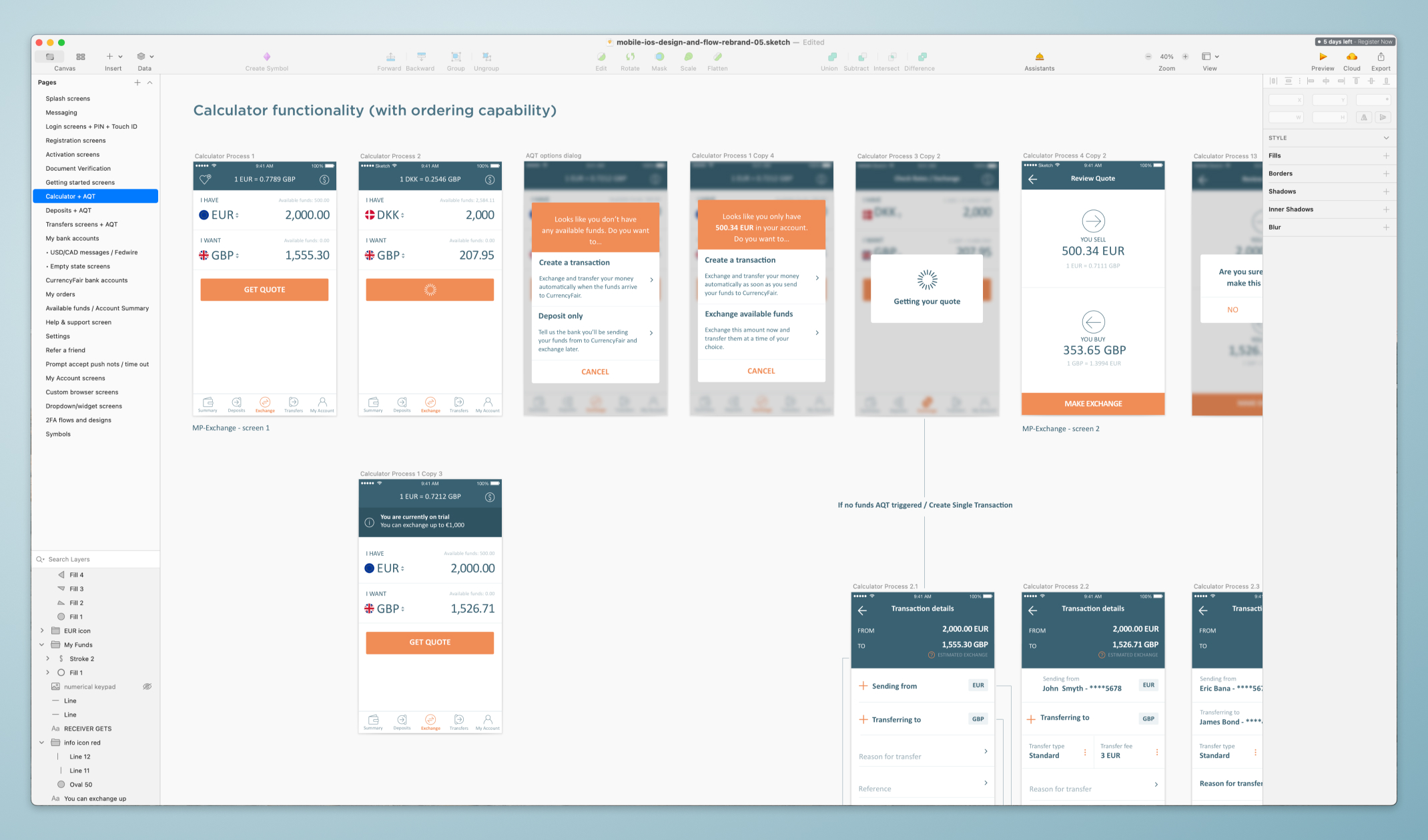
A screengrab of my sketch file at the time where I put together all the flows of the app.
The level of detail on every aspect of the screens was necessary to be able to communicate with the agency developing it.
App Launch and Customer Feedback
The app was officially launched in the Apple Store near midnight on a Friday, a milestone celebrated by the entire team. The launch marked a significant achievement for the company, and initial customer feedback was highly positive. The app filled a long-standing gap, offering our users the convenience of managing their transactions on the go.
However, with the increase in mobile users, we began gathering feedback to improve the experience and add new features. Continuous improvement became a priority.
Tackling User Frustrations: Authentication Flow
One of the first major user complaints came from the login and authentication process. Initially, the app mirrored the web app’s login flow, which required a username, password, two-factor authentication, and a PIN. On desktop, this made sense for security, but on mobile, it became cumbersome and frustrating for users.
After collecting feedback and recognizing the need for a more seamless experience, I researched competitor solutions and proposed a new flow using PIN and TouchID for a more intuitive and secure mobile login. Once I got approval from the Head of Product and CTO, I worked closely with the development agency to implement these changes, significantly improving the user experience.
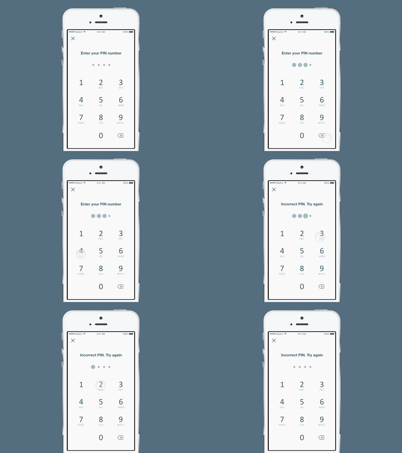
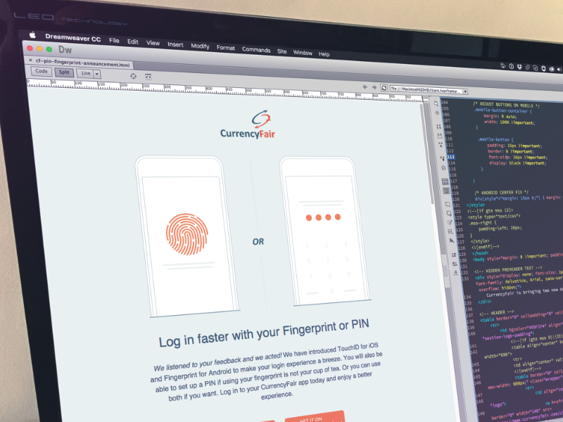
A prototype I built to demonstrate the user of pin on the mobile. Once implementation release, I designed an email announcement to all our customers
Rebranding and Its Impact on the Mobile App
During the development of the mobile app, an agency that also happened to be one of our investors imposed a condition for their investment—they would lead a rebrand of the company. Naturally, this rebrand extended across all of our products, including the mobile app.
Given that the core user experience would remain unchanged, I approached this rebrand by focusing on efficiency. Instead of recreating every flow and screen from scratch, I built a system of reusable components that were used throughout the app. These components were then passed to the design agency, allowing them to easily apply the new colors, fonts, and branding elements to the app. This not only saved time but also ensured consistency across the product.
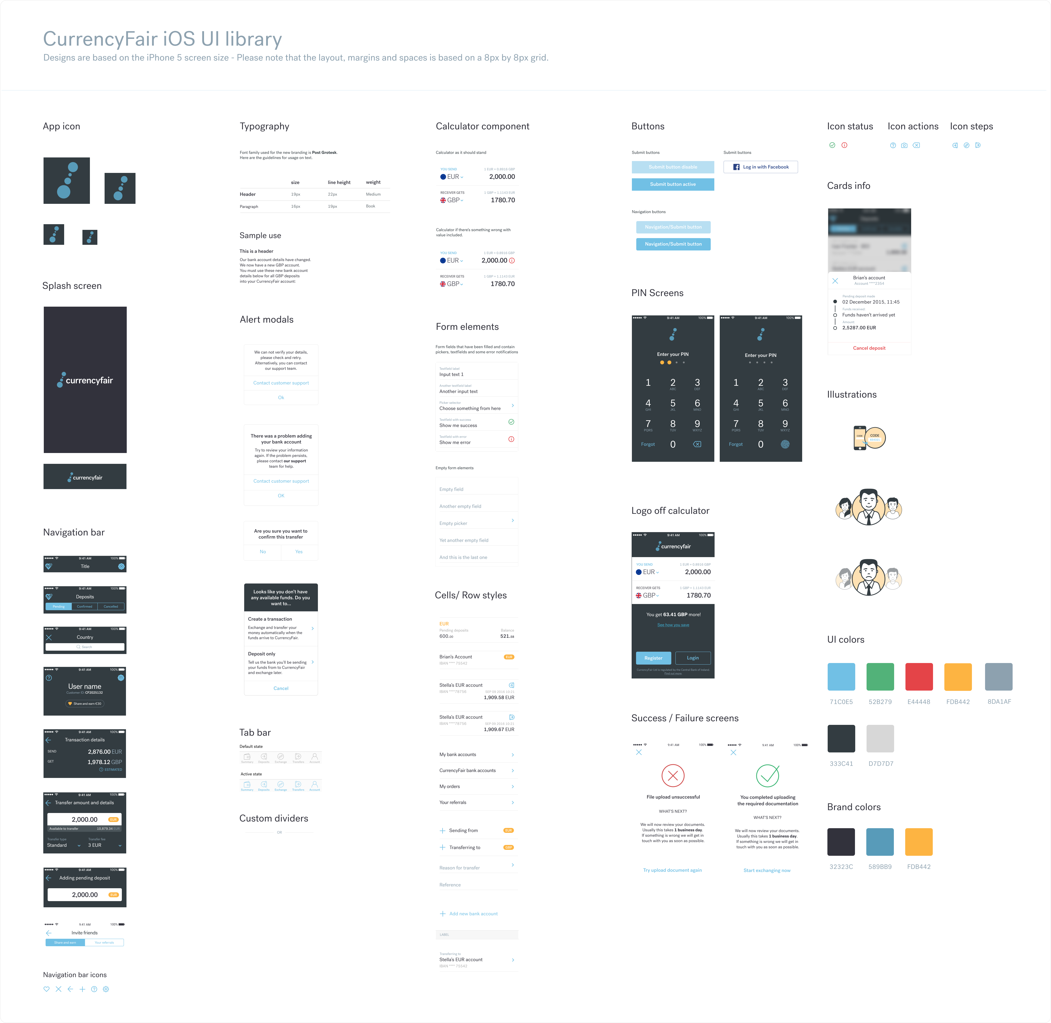
A library of UI components I built to communicate with the design agency and simplyfy the rebranding process
Simplifying the Sign-up Process
Another challenge was the sign-up process. Due to regulatory requirements and Anti Money Laundering (AML) compliance, we had to ask users a lengthy series of questions when they signed up. The original solution simply loaded the desktop sign-up flow into the mobile app, which frustrated users with a tedious process.
To improve this, I gathered customer feedback and redesigned the sign-up experience for mobile. The new flow broke the process into manageable chunks, allowed users to save their progress, and even influenced improvements in the desktop experience.
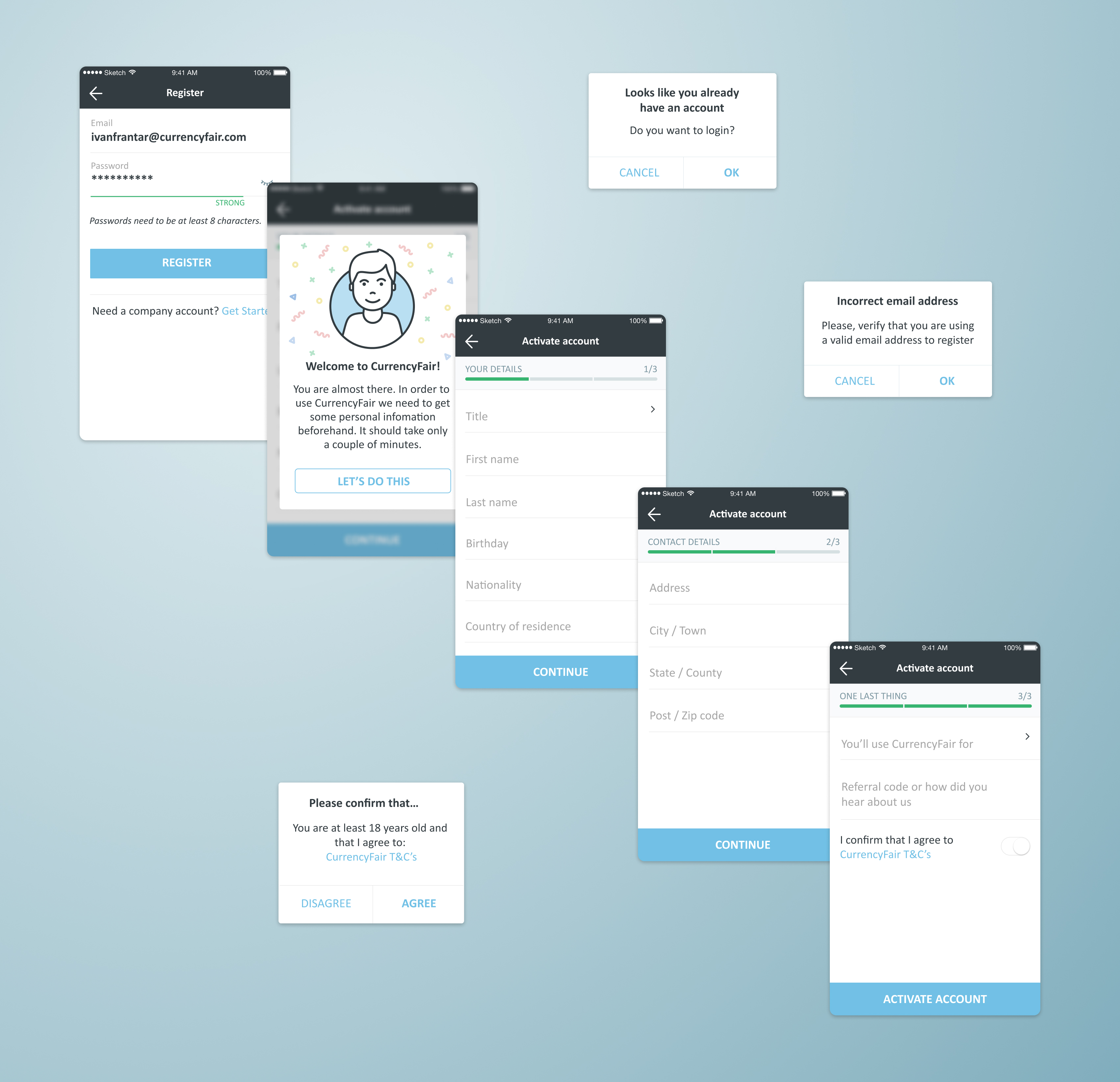
A library of UI components I built to communicate with the design agency and simplyfy the rebranding process
Key Learnings
Working on the CurrencyFair mobile app taught me the nuances of mobile UX, especially the importance of adapting desktop-first experiences to mobile users' needs. It also emphasized the need for continuous user feedback and iteration, as well as a deep understanding of security and compliance in fintech.
